Very Peri – Pantone’s Color of the Year 2022
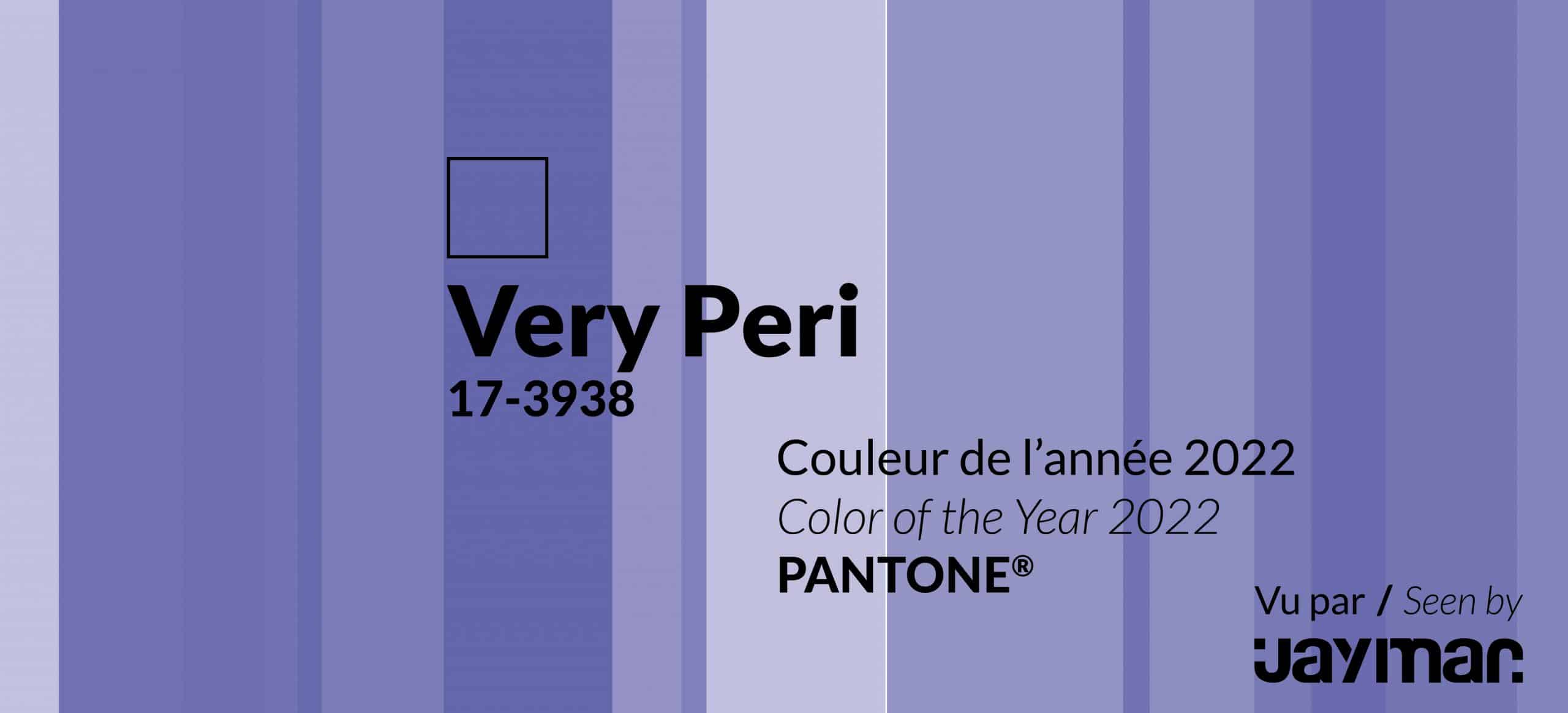
As Pantone unveils the 2022 color of the year, discover how to use it, play with it. Get ready to be inspired.
See how to use Very Peri in your home
Balancing Act
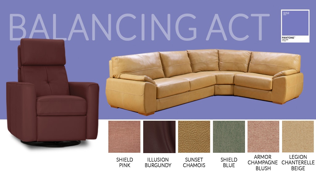 This palette is composed of colors “whose natural balance of warm and cool tones support and enhance one another”. Here are 3 fabrics and 2 leathers you could use.
Armor Champagne Blush will bring warmth to your room. Since Very Peri is a little colder, these ones are warmer tones to compensate. Legion Chanterelle Beige and Legion Light Blue would keep your room in the same ambiance, with cool tones. The yellow tones of Legion Chanterelle Beige are soft enough to blend in and procure an ambiance as soft as a Persian cat.
For more style, our Sunset Chamois leather has a soft tone of yellow, but the leather adds a touch of refinement. Playing with colors and textures will give style to your room. Also, Illusion Burgundy will add warmth with its dark red color.
Wellspring 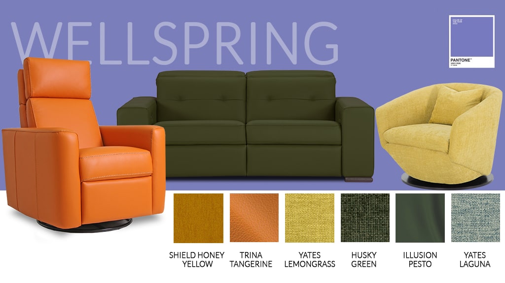
The Star of the Show
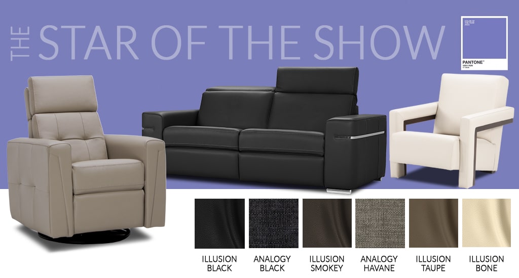 It is a bold move to choose unusual colors. Then make them shine! Let this color be the main character of your room, not just an extra in the background. For this, use neutral colors for your cover.
For fabric options, Analogy Black or Analogy Havane are darker colors able to bring sophistication to the room.
If you are courageous enough to go for a color like Very Peri, you should definitely step up your game with a great leather. Illusion Taupe and Illusion Smokey are classics that would stand the test of time with flair. We all have black clothes in our closet that can be worn at any occasion. Illusion Black will be there no matter what surrounds it.
Amusements 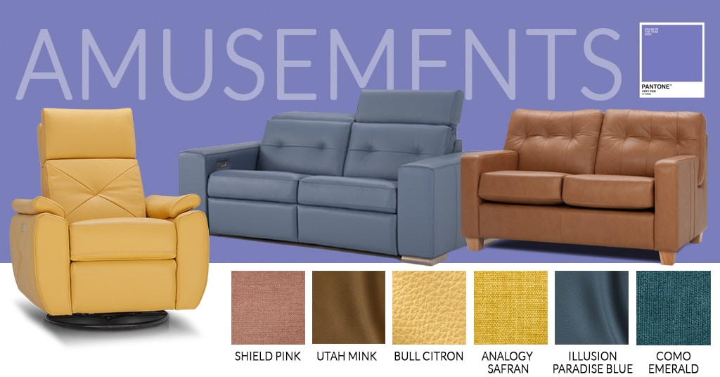 The lollipops are fun and colorful. Jump into a world filled with colors. Candy shops will envy you for sure.
Bull Citron or Illusion Paradise Blue are some of our most colorful leathers. Leather allows the color to shine brighter.
If you are considering fabric, Analogy Safran, Shield Pink and Como Emerald would be perfect choices. They would also add texture to the room.
Arguing about a choice of cover or a color would be ridiculous. However, we know a thing or two about the grade of leather to make sure it lasts as long as possible. Same thing for the fabrics. Stop by our showroom so we can have a little talk about your projects.